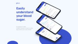
Gluco
Over the course of 3 months I focused together with a team of 3 on changing how Type 1 diabetes is experienced. Since no one in the team has Type 1, through the course of this project we established strong relationships with the community to ensure that we effectively understood the problem space and created solutions that stand as a landmark of what health tech should be.
From the very beginning to the end, this project was designed with a close feedback loop with the Type 1 community. What started initially as coffee chats turned into a long conversations on their daily frustrations. We were incredibly grateful to receive the opportunity to work so closely with our users to make something they truly loved.
Topic
Type 1 Diabetes Management
Role
Research, Visual Design, UX/UI Design
The Problem
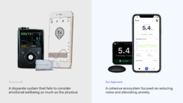
The technology people use to manage their blood sugar fails to understand how they feel in their daily lives.
→ Design Challenge
How might we reduce anxiety for people that manage their blood sugar on a regular basis?
Research with a purpose
Whether it is to better understand the people we are designing for or just learning more about Type 1 – every bit of research was done with intention. We've committed early on to never do research in a silo and took full advantage of the relationships established early on to also conduct primary research.
Benchmark
Provided us a strong context of the current product market.
PACT Analysis
Helped us understand the various contexts of the technology being used.
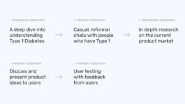
With our goal to create an application that could be realistically deployed, we prioritized the essential functions with our User Interviews.
User Testing
Preparing for our user tests through the DECIDE framework.
Persona
Based on the real people we've met; helped us personalize the experience by using them as valuable reference.
MoSCoW Method
Made prioritizing features and managing scope much easier.
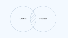
Designing for emotion.
Although diabetes is related to how people physically feel, we learned that the products they use to manage their diabetes have a significant influence on their emotional wellbeing as well.
Usability alone is not enough. This meant that focusing on just usability and functionality is not enough. What is the balance between keeping the user informed vs. intruding their personal mental space? How do our users feel using our product? Since so much of how they feel daily is determined by the product – it should act less as a third party and more as an extension of themselves.
Pain Points
Whether it is to better understand the people we are designing for or just learning more about Type 1 – every bit of research was done with intention. We've committed early on to never do research in a silo and took full advantage of the relationships established early on to also conduct primary research.
No way of sharing data temporarily
Athletes mentioned that they would like to share their Blood Sugar with a third party (such as their coach), but only for a limited time.
Poor Interface
The current experience failed to present important information to the user without inflicting a negative emotional response.
Outdated Form Factor
We discovered that children were self conscious of using the devices and were reluctant to administering their Insulin around their peers.
Tedious Process
Users have to coordinate with two different devices (a CGM and an Insulin Pump) to administer their Insulin — making it difficult to coordinate.
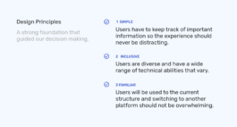
Validating decisions
Validating decisions through a feedback loop with the community. Our overarching goal was to identify any gaps in our knowledge, overlooked issues and friction points with the decisions made so far.
→ Copywriting
Adjusted the copy to sound less "medical" and formal to being more human.
→ Microcopy
Added microcopy that explained why needed certain information and how bolus was calculated.
→ Hierarchy
Adjusted information architecture to highlight what's most important.
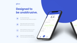
Simple, familiar – and completely new.
The Gluco app syncs with the physical ecosystem to allow users to check in on their blood sugar, administer insulin and share their status with others. There when you need it. Unobtrusive when you don't.
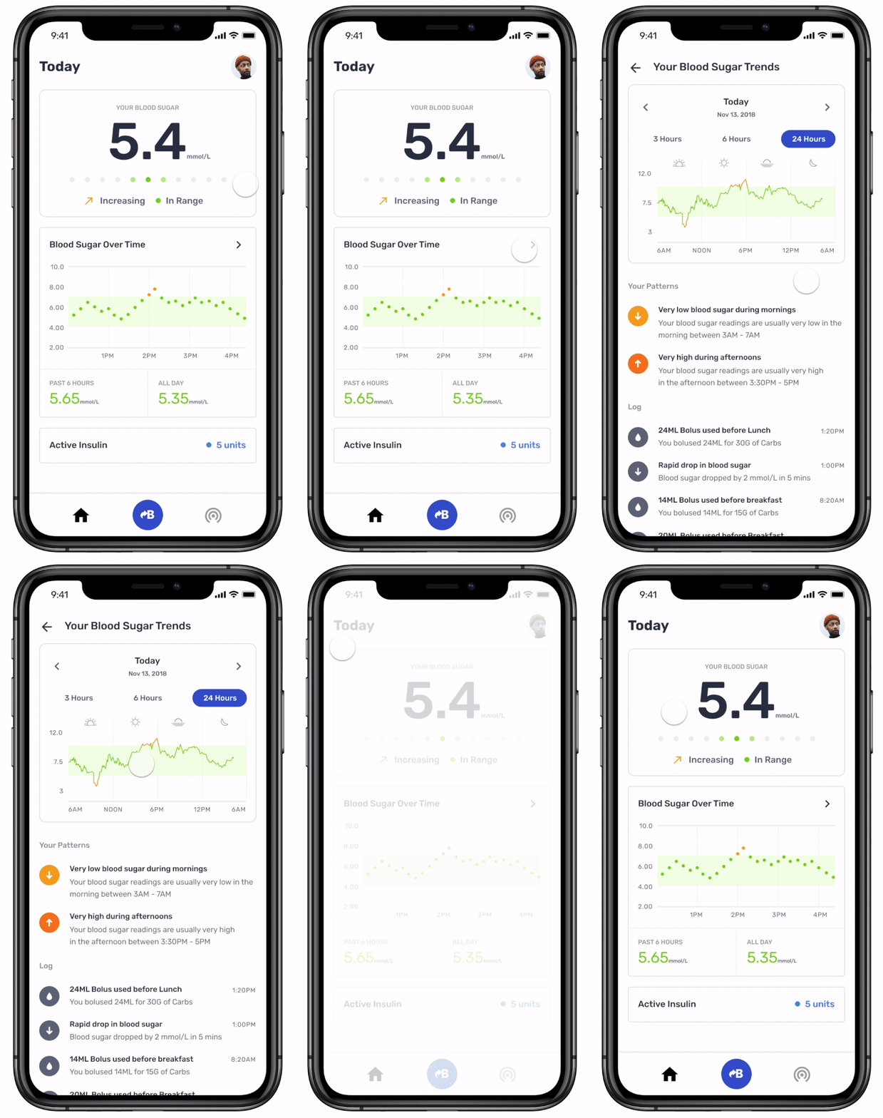
Stay Informed
Gluco informs the users without causing stress and anxiety by focusing on the information that matters most to them.
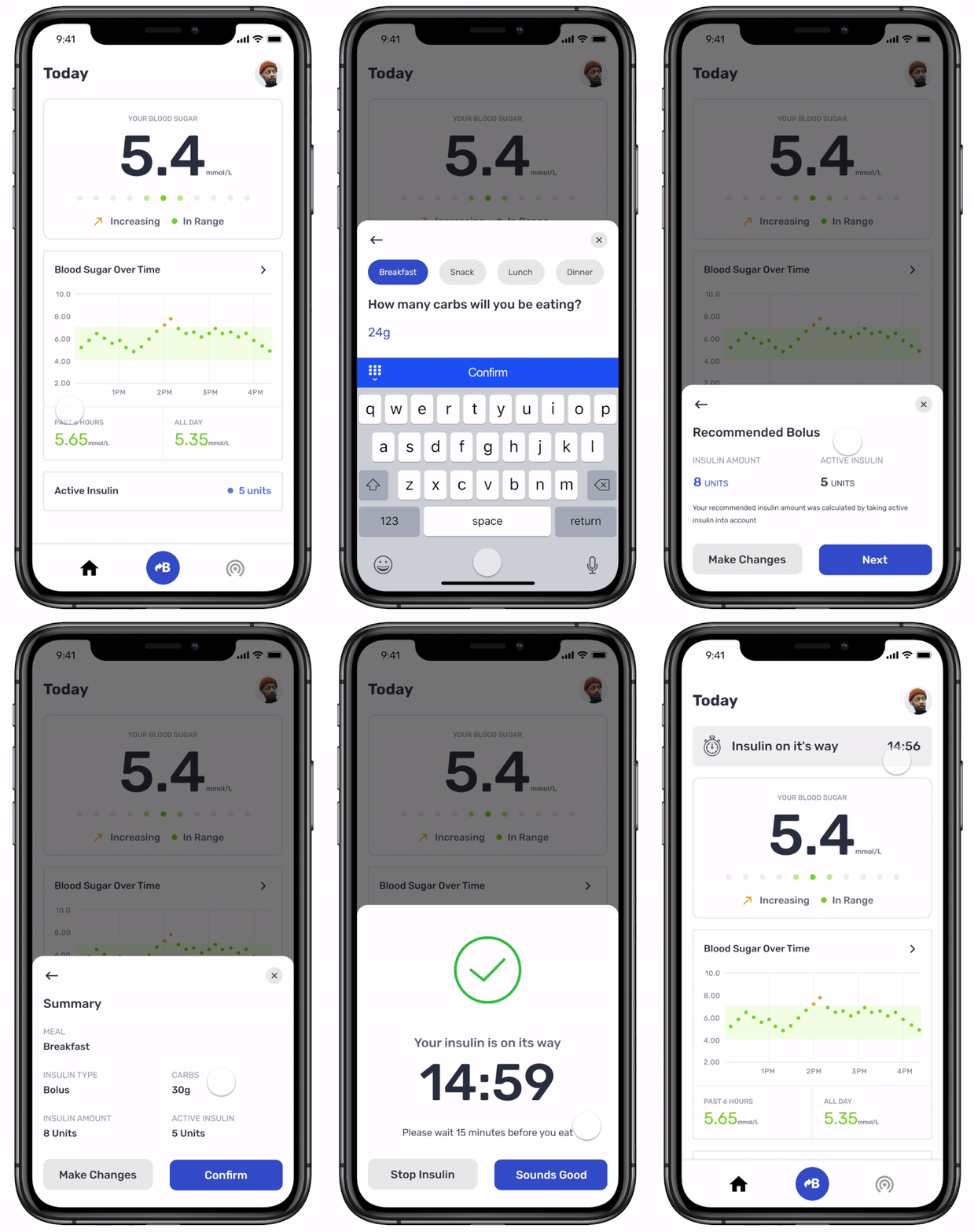
Add Insulin
A simple and informative flow allows the user to calculate amount of Insulin needed. The user is then able to administer it into their body through the pump.
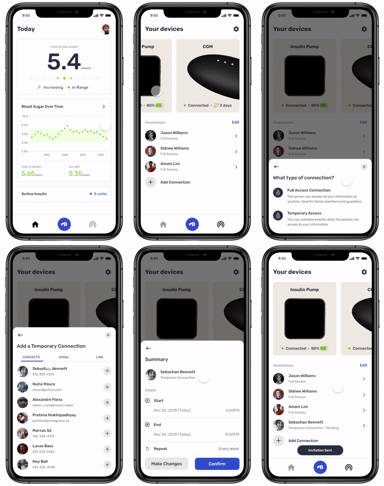
Sharing Data
A feature users really wanted, especially athletes, was being able to share data for a limited time with someone else. Users still have the option to share their data without a time limit.
Through this project we’ve realized that as designers of the product we are always at least a little bit biased towards ourselves. We worked hard to establish a meaningful relationship early on with our users and – although not perfect – this project provided insight into the value of what we do and the importance of making sure that we never lose sight of the meaning behind our work.